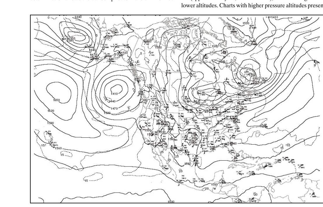
Weather does not exist in a single layer. A thunderstorm towers from the surface to the tropopause, a jet stream influences cruise-altitude winds at flight levels, and a low-pressure system's circulation extends tens of thousands of feet into the sky. To capture this three-dimensional reality, meteorologists and pilots rely on two complementary sets of charts: surface analysis charts, which depict conditions on a constant-altitude surface (typically sea level), and upper-air analysis charts, which depict conditions on constant-pressure surfaces. Understanding how these upper-air charts are constructed, what they show, and how to read them is a core skill for any instrument-rated pilot or aviation weather consumer.
The National Weather Service (NWS) produces a standard suite of upper-air charts that support the aviation community. Each chart is a snapshot — a map showing the state of the atmosphere over a large area at one specific moment in time. According to the FAA Aviation Weather Handbook (FAA-H-8083-28B), Chapter 25, these charts are built from a rich variety of observation sources and then analyzed through a disciplined process of drawing lines of equal value, called isopleths, to reveal meaningful weather patterns.
Constant-Pressure Surfaces Explained
A constant-pressure surface is an imaginary surface in the atmosphere along which the atmospheric pressure is everywhere the same. Because pressure decreases with altitude, each standard pressure level corresponds to a different average height above sea level. The most commonly used constant-pressure levels in aviation weather analysis are 850 mb (~5,000 ft MSL), 700 mb (~10,000 ft MSL), 500 mb (~18,000 ft MSL), 300 mb (~30,000 ft MSL), and 200 mb (~39,000 ft MSL). Rather than measuring conditions at a fixed altitude everywhere, a constant-pressure chart measures conditions at whatever altitude the chosen pressure level happens to be at each location. Where the atmosphere is warmer and therefore expanded, the 500 mb surface might be at 18,500 ft; where it is colder and compressed, it might be at 17,500 ft. That variation in height is itself meteorologically significant and is what the chart's contour lines depict.
This stands in direct contrast to surface analysis charts, which fix the altitude (sea level) and let pressure vary from place to place — hence the isobars (lines of equal pressure) that pilots associate with weather maps shown on the evening news. Upper-air charts fix the pressure and let height vary, so their primary grid lines are contour lines (also called isoheights), which connect points of equal elevation of that pressure surface above MSL.
Observation Sources That Feed Upper-Air Charts
The FAA Aviation Weather Handbook identifies several key data sources used to build weather analysis charts. For upper-air analysis, the most critical are:
- Radiosondes — balloon-borne instrument packages launched twice daily (00Z and 12Z) from a global network of upper-air stations. They measure temperature, dewpoint, pressure, and wind at every level as the balloon ascends through the troposphere and stratosphere.
- Dropsondes — similar packages dropped from aircraft (commonly used in hurricane reconnaissance) to sample the atmosphere on the way down.
- Pilot balloon (pibal) observations — track a released balloon optically to derive wind data.
- Wind profilers and Doppler radar VAD wind profiles — remotely sense wind speed and direction at multiple altitudes without launching balloons.
- Aircraft reports (AIREPs, PIREPs, AMDAR, ACARS) — commercial and general aviation aircraft continuously transmit in-flight temperature and wind data, supplementing the radiosonde network between launch times and locations.
- Satellite data (GOES sensors) — provide temperature and moisture profiles and derive wind estimates by tracking cloud and water-vapor movement.
All of these sources feed into the analysis process, with quality control to remove erroneous data before drawing begins.
The Analysis Process: Drawing Isopleths
Analysis, as defined in FAA-H-8083-28B, is the drawing and interpretation of patterns of atmospheric elements on a weather chart. It is fundamental to forecasting: meteorologists cannot predict where weather will be tomorrow if they do not accurately understand where it is right now. Computers perform the bulk of operational analysis, but human meteorologists still apply subjective judgment to interpret the results.
The FAA handbook likens the analysis process to a dot-to-dot drawing exercise. The analyst begins with a field of plotted data values — numbers scattered across the map — and draws smooth lines connecting points of equal value. These are the isopleths. The most common isopleths on upper-air charts include:
- Contour lines (isoheights) — connect points of equal height of the constant-pressure surface above MSL. They function like the isobars on a surface chart, revealing highs, lows, ridges, and troughs at altitude.
- Isotherms — connect points of equal temperature. On upper-air charts they reveal cold and warm air masses, jet stream thermal gradients, and areas of potential icing.
- Isotachs — connect points of equal wind speed. Critical for identifying jet stream cores and areas of significant turbulence.
- Isohumes and isodrosotherms — connect points of equal humidity or dewpoint, useful for identifying moisture plumes and potential cloud or icing layers.
Step-by-Step Analysis Procedure
The procedure follows three formal steps. First, the analyst surveys the data to identify the maximum and minimum values and selects an appropriate contour interval — the difference in value between successive isopleths. The interval must be fine enough to show significant weather features but coarse enough that the chart remains readable. On NWS products, standard intervals are used (for example, 4 mb for surface isobars, 60-meter intervals for 500 mb height contours). Every contour value must be evenly divisible by the chosen interval.
Second, isopleths and extrema are drawn following strict rules: isopleths must be smooth curves without kinks between data points; all data values must be higher than the isopleth value on one side and lower on the other; closed loops must contain an embedded extremum (a high or low center); isopleths can never cross, overlap, or extend beyond the data domain; and every isopleth must be labeled. Interpolation between known data points is routine and expected.
Third, significant weather features are identified and labeled. On upper-air charts, a high denotes a maximum of height on the constant-pressure surface (an anticyclone aloft), and a low denotes a minimum of height (a cyclone aloft). A ridge is an elongated area of relatively high heights; a trough is an elongated area of relatively low heights. Temperature extrema are labeled W (warm) and K (cold), from the German warm and kalt. Wind speed extrema use X (maximum) and N (minimum).
Why Upper-Air Charts Matter to Pilots
Upper-air charts translate directly into practical flight planning decisions. The 500 mb chart, at an average height near 18,000 feet MSL, is the classic synoptic-scale forecasting tool: the position of troughs and ridges at 500 mb strongly influences where surface weather systems will develop and move over the next 24–48 hours. The 300 mb and 200 mb charts place the jet stream, with isotachs highlighting core wind speeds that can exceed 150 knots; clear-air turbulence tends to develop in the zones of strongest wind shear, where isotachs pack tightly along the edges of the jet core, particularly on the cold (poleward) side near the tropopause. The 850 mb chart reveals low-level warm and cold advection patterns and freezing-level positions relevant to icing. Integrating all of these levels gives a complete three-dimensional picture that no single surface chart can provide.
Pilots flying IFR cross-country routes use upper-air analysis products — in forms such as the Winds and Temperatures Aloft forecast (FB winds) and the Graphical Turbulence Guidance (GTG) — that are derived from exactly the kind of constant-pressure analysis described here. Understanding the underlying charts makes the derived products far more intuitive.
Key Numbers and Rules
- Standard pressure levels: 850 mb (~5,000 ft), 700 mb (~10,000 ft), 500 mb (~18,000 ft), 300 mb (~30,000 ft), 200 mb (~39,000 ft).
- NWS surface isobar interval: 4 mb (starting value 992 mb in the handbook example).
- Contour interval divisibility rule: every plotted contour value must be evenly divisible by the chosen contour interval.
- Isopleths never cross, overlap, or extend beyond the data domain.
- Closed-loop isopleths always enclose an extremum — a high or low center.
- Temperature extrema labels: W = warm, K = cold (from German); pressure/height extrema: H = high, L = low.
- Radiosonde launches: typically 00Z and 12Z daily, forming the backbone of upper-air data.
Common Test Traps
- Confusing surface and upper-air chart conventions. Surface charts use isobars (constant pressure lines); upper-air charts use contour lines (constant height of a pressure surface). Students often mix up which line type belongs on which chart.
- Assuming a high aloft equals high pressure at the surface. Upper-air highs and lows are defined by height of the pressure surface, not surface pressure — the systems can be offset or even opposite in some thermal situations.
- Misidentifying temperature labels. The labels W and K come from German; K means cold, not warm. Exams exploit the K = cold convention.
- Forgetting the divisibility rule. A contour interval of 4 means valid contour values are 992, 996, 1000, etc. — not 993 or 997. Questions sometimes test whether students can identify a valid starting contour.
- Believing computers eliminate the need for human analysis. FAA-H-8083-28B explicitly states computers can analyze but cannot interpret — human meteorologists still perform subjective analysis. An exam question may ask which step requires human judgment.