Before every flight, a sport or recreational pilot must check the weather — not just glance at the sky, but systematically gather and interpret aviation weather products. Two of the most fundamental graphical tools are the surface analysis chart and the weather depiction chart. Both give you a snapshot of current conditions across a wide geographic area, and together they tell a powerful story about what the atmosphere is doing right now.
Surface Analysis Charts
A surface analysis chart is a synoptic-scale map that shows conditions at the Earth's surface, produced by the National Weather Service and updated every three hours. On this chart you will find isobars — lines connecting points of equal sea-level pressure, measured in millibars. Isobars drawn close together indicate a steep pressure gradient and therefore stronger winds; widely spaced isobars suggest lighter winds. The chart also identifies high-pressure centers (marked with a blue H) and low-pressure centers (marked with a red L). Air circulates clockwise and outward around highs in the Northern Hemisphere, and counterclockwise and inward around lows. Lows are almost always associated with unsettled weather, clouds, and precipitation.
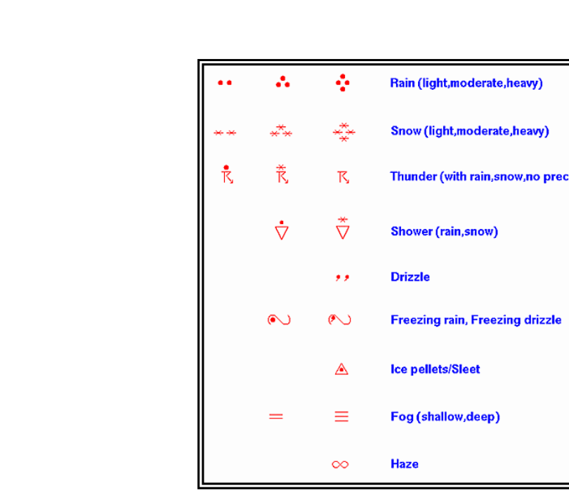
Fronts are plotted on the surface analysis chart as well. A cold front is shown as a blue line with triangular pips pointing in the direction of movement; a warm front appears as a red line with semicircular pips; a stationary front alternates both symbols on opposite sides of the line; and an occluded front is shown in purple with alternating triangles and semicircles on the same side. Station models at various reporting locations show wind direction and speed, temperature, dew point, current weather, sky cover, and sea-level pressure. Because the chart is analyzed from actual observations, it reflects real, current conditions rather than a forecast.
Weather Depiction Charts
The weather depiction chart is derived from METAR reports and was historically one of the first products a pilot would study during preflight planning. It provides a broad overview of IFR, MVFR, and VFR flight conditions plotted geographically. Each station circle on the chart shows the ceiling and visibility at that location. The chart uses shading or contouring to highlight regions of instrument flight rules (IFR) conditions — ceiling below 1,000 feet and/or visibility less than 3 statute miles — and marginal VFR (MVFR) conditions — ceiling 1,000 to 3,000 feet and/or visibility between 3 and 5 statute miles. Unshaded areas represent VFR conditions with ceilings above 3,000 feet and visibility greater than 5 statute miles.
It is important to note that the weather depiction chart shows observed conditions at the time of the chart, not a forecast. For planning purposes, it should always be paired with current METARs, TAFs, and AIRMETs or SIGMETs to build a complete picture of weather along your route.
Why It Matters
Sport pilots are limited to visual flight rules (VFR) operations and may not fly into clouds or in instrument meteorological conditions (IMC). Understanding how to read these charts lets you identify areas of low ceilings, poor visibility, frontal activity, and pressure gradients that signal deteriorating weather — before you ever leave the ground. Catching an approaching low-pressure system or a region of IFR conditions on a surface analysis chart could literally save your life by keeping you on the ground when conditions are unsafe.
Memory Aid
For flight categories, remember "3, 1 — you're done": if visibility drops below 3 statute miles or ceiling drops below 1,000 feet, you're in IFR territory and a sport pilot must not fly. For MVFR, think of it as the "yellow zone" — proceed with caution because conditions can quickly slide to IFR.
Common Test Traps
- Surface analysis charts are not forecasts. They depict current observed conditions. Do not confuse them with prog charts, which show forecast conditions at future times.
- IFR minimums on the weather depiction chart are ceiling below 1,000 feet AND/OR visibility less than 3 SM — either condition alone qualifies an area as IFR, not both together.
- Isobar spacing indicates wind strength, not direction. Wind direction at the surface is read from station models or inferred from pressure centers — remember, winds flow roughly parallel to isobars but curve slightly inward toward lows due to friction.
- The weather depiction chart is based on METARs, so it reflects conditions at reporting stations only — large gaps between stations can hide localized hazards along your route.