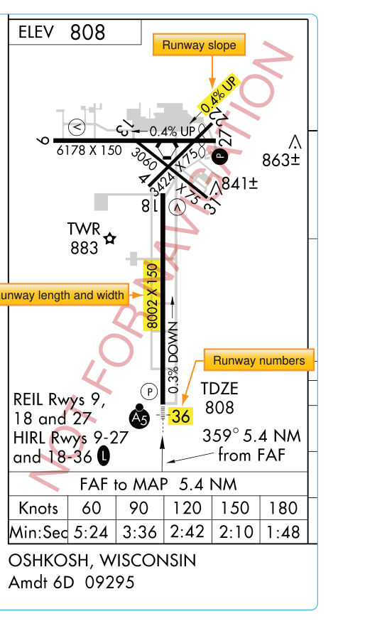
Every instrument approach chart published in the FAA's Terminal Procedures Publication (TPP) includes a small but information-dense graphic in the lower portion of the chart: the airport diagram or, on some charts, a simplified inset plan. These drawings are far more than decorative — they are precision navigation tools that help pilots orient themselves the moment the runway environment comes into sight, verify they are aligned with the correct runway, and plan their taxi after landing. Understanding every element of this diagram is part of becoming a competent instrument pilot and a topic the FAA Instrument Rating knowledge test tests directly.
This article walks through the components, symbology, and practical use of airport diagrams and inset plans, grounded in the FAA's Instrument Flying Handbook (FAA-H-8083-15) and Instrument Procedures Handbook (FAA-H-8083-16).
What Is the Airport Diagram?
The airport diagram printed on an approach chart is a top-down, north-up (or north-oriented) schematic of the airport. It depicts the runways, taxiways, terminal buildings, control tower (if present), hangars, obstructions on or near the field, and other significant features. On simpler airports the graphic may be called an inset plan — a less detailed version that nevertheless conveys the runway configuration clearly. Both appear in the lower portion of the approach chart, typically in the section alongside the minimums table.
It is important to understand the difference between these diagram graphics and the full-page airport diagrams published separately in the TPP — sometimes called "airport taxi charts" or "airport surface diagrams." Those full-page charts are designed for detailed ground taxi operations and include much finer detail: holding position signs, taxiway designations, frequency information, and hotspot locations. The inset on the approach chart is a condensed version intended specifically to assist the pilot during the instrument approach itself. However, both types share the same north-up orientation standard and use the same FAA symbology conventions.
Key Components of the Airport Diagram on an Approach Chart
Runway Layout and Identifiers
Each runway is drawn to approximate scale and labeled with its runway number at both ends. The magnetic heading (rounded to the nearest ten degrees) is inherent in the runway number — Runway 27 is approximately 270° magnetic. This immediately tells a pilot whether the runway depicted aligns with the final approach course. Closed runways are indicated with an X symbol. The diagram also shows runway dimensions in some publications, though length and width data is more authoritatively found in the Airport/Facility Directory (now the Chart Supplement U.S.).
Runway Lighting Symbology
Lighting information on the airport diagram is critical for night and low-visibility operations. The FAA uses standardized line styles along runway edges to convey lighting type:
- High-Intensity Runway Lights (HIRL): shown with a bold or distinctive edge-line symbol.
- Medium-Intensity Runway Lights (MIRL): shown with a lighter or dashed line.
- Threshold and end lights: green at the threshold, red at the runway end — indicated by small marks at the runway extremities.
- Touchdown Zone Lights (TDZL) and Centerline Lights (CL): indicated by symbols within the runway boundaries, relevant for Category II/III operations.
- Approach Lighting System (ALS): the type and length of the approach light system (e.g., ALSF-2, MALSR, ODALS) is noted either on the diagram or in a legend box adjacent to it.
Knowing whether approach and runway lighting exists — and what type — directly affects which visibility minimums apply. Certain reductions to Runway Visual Range (RVR) minimums are only authorized when specific approach lighting systems are operative. A pilot who overlooks this information during preflight chart review may be surprised by higher minimums when a lighting component is NOTAM'd out of service.
Displaced Thresholds and Stopways
A displaced threshold is indicated by arrows pointing toward the usable threshold and a dashed line across the runway. The area before the displaced threshold may be used for takeoff but not for landing. Recognizing this on the airport diagram prevents the error of landing short of the actual threshold. Stopways and clearways extend beyond the runway end and are depicted with a distinct pattern to show they are not paved to full runway standards or are not suitable for normal operations.
Obstructions and Elevation Data
The airport diagram on an approach chart often notes the airport elevation in feet above mean sea level (MSL) and may call out significant on-airport obstructions with elevation tags. This helps a pilot correlate the Minimum Descent Altitude (MDA) or Decision Altitude (DA) on the minimums table with the actual terrain and structure environment they should expect to see at that altitude. The touchdown zone elevation (TDZE) — the highest elevation in the first 3,000 feet of the landing surface, measured from the landing threshold — may also appear, since it is the reference for setting altimeters and computing height above touchdown (HAT).
Control Tower and Other Structures
The control tower location is typically depicted with a small symbol and sometimes labeled "TWR." Knowing where the tower is relative to the runways helps pilots understand traffic-flow geometry and confirms their mental model of the airport layout before they break out of the clouds. Terminal buildings, hangars, and fuel facilities may be shown schematically to provide orientation during taxi after landing.
Compass Rose and Orientation
Airport diagrams are oriented with magnetic north up by convention, with a north arrow displayed. Because the entire instrument approach system — approach courses, runway headings, compass bearings — is magnetic, a north-up magnetic diagram allows direct correlation between the chart and the aircraft's heading indicator during the approach.
Why the Airport Diagram Matters in the Instrument Environment
In VMC, a pilot looking out the window can easily confirm runway identity and orientation. In IMC or low-visibility conditions, that luxury disappears. The airport diagram bridges the gap: when a pilot breaks out at minimums, they should already have a clear mental picture of what they should see directly ahead and whether the runway environment they acquire matches the expected layout.
Consider a real scenario: an airport has parallel runways, Runway 28L and 28R. Both have similar approach lighting. A pilot flying the ILS to Runway 28L who has not studied the airport diagram might momentarily acquire 28R's approach lighting and become confused about which runway is ahead. A quick pre-approach review of the airport diagram — noting the relative positions, terminal buildings, and taxiway layout — dramatically reduces that risk. The Instrument Procedures Handbook emphasizes this kind of situational awareness building during the approach briefing phase.
The diagram also aids the transition to taxi. After a demanding instrument approach in low IMC, a pilot who has studied the airport diagram knows in advance where the turnoffs are, which taxiway leads to the ramp, and where to expect holding-position markings. This reduces head-down time after landing — a phase when runway incursions are a known risk.
Key Numbers and Rules
- Airport diagrams on approach charts use magnetic north orientation by convention.
- The touchdown zone elevation (TDZE), measured from the landing threshold, is the reference for Height Above Touchdown (HAT), used in computing Category I minimums.
- A displaced threshold is shown by a dashed line and arrows; landing before it is not authorized.
- The approach light system type (e.g., ALSF-2, MALSR, SSALR) affects whether RVR minimums can be reduced per the minimums table notes.
- Full-page airport diagram charts (taxi diagrams in the TPP) are separate from the approach chart inset and provide greater taxiway detail, including hotspots.
- NOTAM review is essential: lighting outages and runway closures that are not reflected on the chart can change both legal minimums and the visual picture at breakout.
Common Test Traps
- Confusing the inset diagram with a full taxi chart: The airport diagram on an approach chart is a planning aid, not a substitute for the detailed airport diagram taxi chart. The knowledge test may ask about the source of specific taxiway or hotspot information — the answer is the airport diagram chart or Chart Supplement, not the approach chart inset.
- Misreading runway lighting symbols: Test questions sometimes ask what a specific line pattern along a runway edge means. Memorize the HIRL versus MIRL symbol difference and recognize that no lighting symbol means the runway has no edge lighting (relevant to night minimums).
- Ignoring the displaced threshold: The FAA test exploits the distinction between the physical runway end and the usable landing threshold. Landing before the displaced threshold is prohibited, and TDZE is measured from the landing threshold in use, which may itself be the displaced threshold.
- Missing the north-up orientation assumption: Students sometimes misread runway positions on the diagram because they assume the diagram is oriented with the approach direction at the bottom. It is not — it is north-up, so you must mentally rotate to match your approach heading.
- Assuming the chart reflects current conditions: Approach charts have amendment cycles. Lighting systems, runway designators after magnetic variation updates, and even runway configurations can change between editions. Always cross-check with current NOTAMs before flight.